Right now, the way X looks on the iPhone Duo is not my preferred way to use X. I use most of my other apps horizontally, but X is the one app I don’t really like to use that way.
That’s because the posts are very wide. They feel too elongated, and they don’t look like the text you’re familiar with. Think of a book. When it’s open, each page only takes up half of the full width. So at the moment, X just doesn’t have good iPhone Duo support, in my opinion. I mocked up roughly how it looks today.
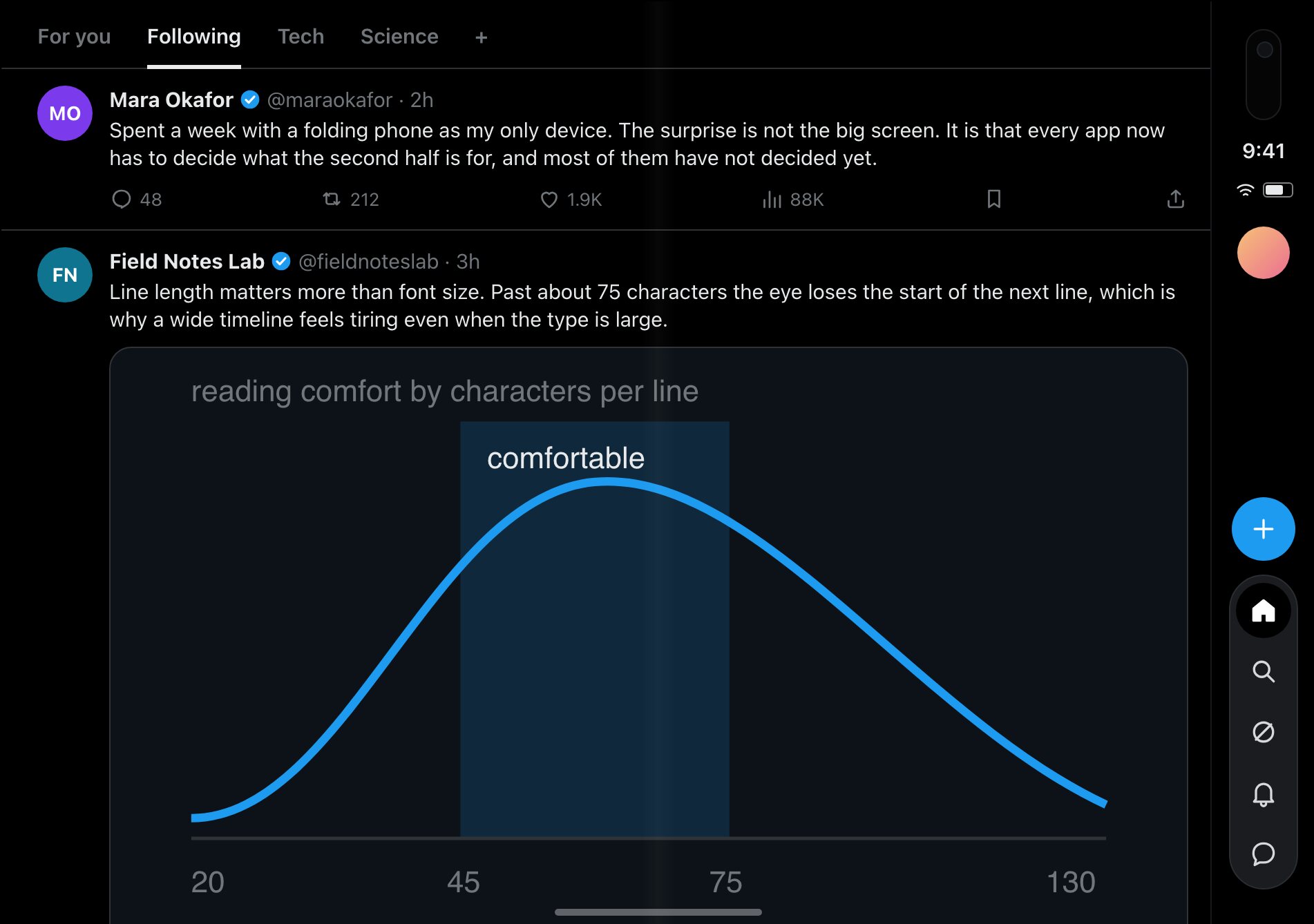
My current workaround is to just use it the way it is, or turn it 90 degrees so it’s more like a regular portrait mode.
To be fair, X did get one thing right. It immediately moved the action buttons more to the right side of the screen, so the tweet button is already on the right. But that’s the most obvious one.
The simple fix would be a narrower, centered column, basically how the desktop version works, where the content is scoped. I agree with that, but I don’t agree with always going for the simple fix.
If I owned X, I would focus on a split user interface that looks like this.
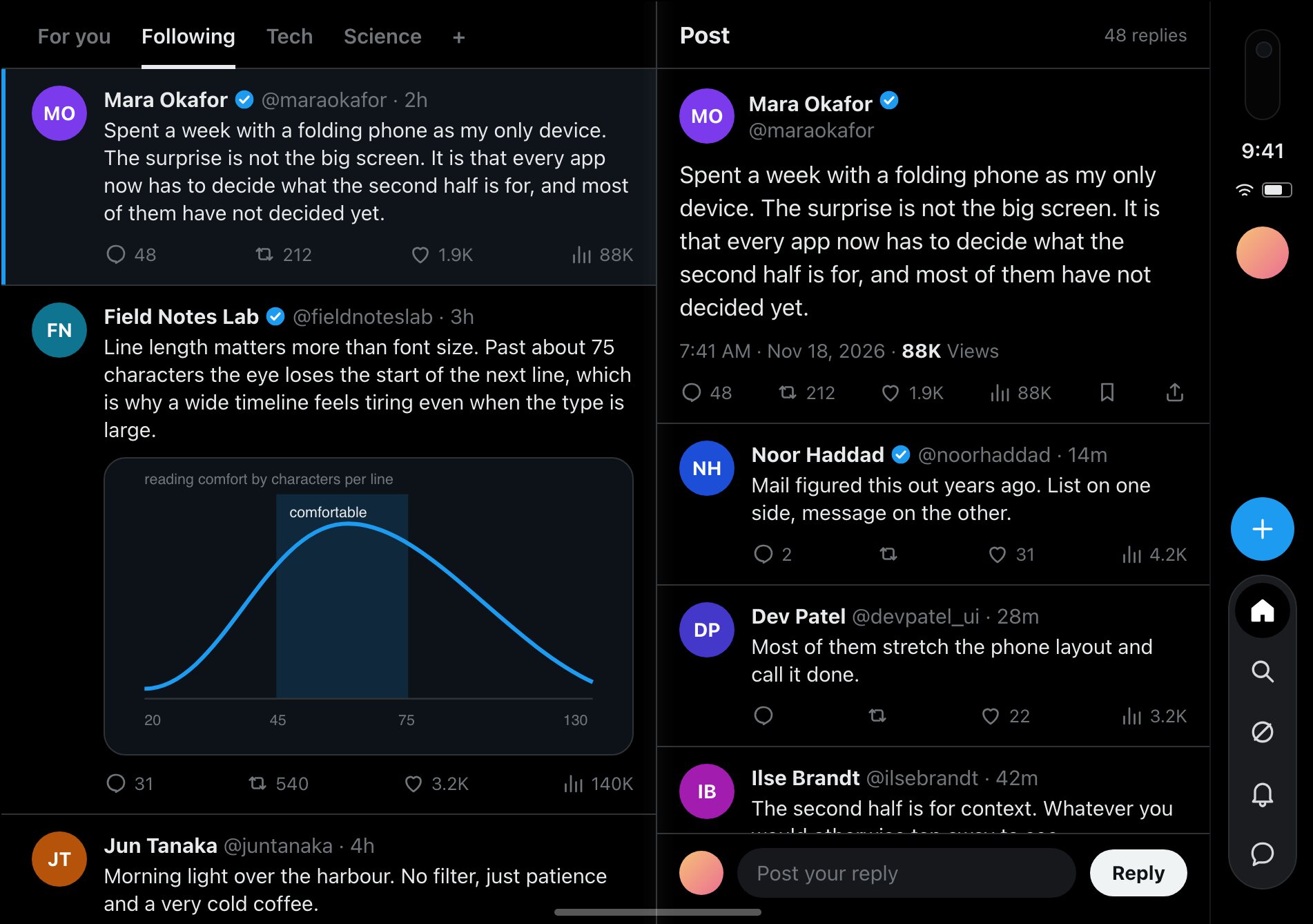
Basically, on the left side, you have your regular timeline, where you see all the posts on X. On the right side, you see the content of the post you selected. I feel like this is more pleasing on the eyes, and it doesn’t show you too much content at once.
If nothing is selected yet, I think it should just select the first post available. If there’s no post available, then maybe even a random post, because the main metric that I think should be relevant is engagement.
Tapping on a photo or video should open it. But in split mode, they should also autoplay, especially videos.
Other layouts, like a deck layout such as X Pro, or a mosaic, show you too many posts at once. They can also update too frequently, and you just get a bit overstimulated. With the split layout, the right side is the content you selected, so that’s where your focus usually goes. It’s similar to how Apple Notes works, or T3 Code, which I like a lot.
Some apps already do this well. My favorite is probably Apple Mail. Photos and Google Photos are pretty good too, but those are photo-centric. I also like Tesla’s new app. Those are the ones I use the most. I wish the banking apps in the Netherlands would upgrade already, but I’m quite sure that’s going to take a while, since it’s banking.
I think this is my preferred user interface if I owned the iPhone Duo design of X. It would just be better in general, and it would probably make people engage with X more often too. Replying is the most engaging part, and right now, because of the single view, you have to tap on a post first before you can reply to it.