Day #7 | My Watch Face Setup ⌚


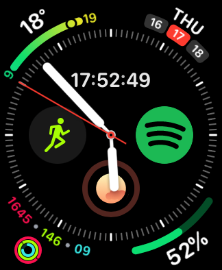
This is my watch face build on the ideas of quick information and opening the apps I use 99% of my time.
I'm using the Infograph watch face.
The reason for using the Infograph watch face is that I hate using the App Switcher or Dock.
Who likes to use their Apple Watch for a longer period than 3 seconds. I don't!
Thus I use the Infograph watch face to have as many options available for customization and also providing me information instantly.
Another requirement it had, is that it needs to provide me information that a normal watch can as well.
So, I started with the digital time is in the middle first. Digital is much more readable than the clock, so I keep it there. Once, I raise my wrist I need to know instantly what time it is. Then in the right corner, I have the calendar, similar to macOS where you can see the date on right.
In the other corners, I chose the weather information on the top-right. Thanks to the weather information, I can see what I need to wear for today.
In the top two corners, the choices provide me information that is usually relevant for others as well. For example, questions to 'what day is it' or 'what is the weather now' can just be answered by looking at my wrist for like a second.
Then on the bottom, I have my activity rings. I try to complete all my rings daily thus I need to know what the progress is. If it is too low, I make time to complete it. By putting it in front immediately I'm more energetic to close them.
The bottom-right corner I use just for the battery. Even though the Apple Watch usually lasts for 1.5~ days, I just like how much battery my tech is.
Then in the middle, I have three apps that I use a lot. They are usually used to either activate a program very fast or adjust it without taking out my phone. For example, when I work out I want to use the workout app immediately. If I listen to music or a podcast, I want to skip asap or turn up/down the volume. Then using Zero to see if my fasting goals are met. The additional benefit of Zero is that it also shows the progression of the current fast.
I sometimes switch between Pocket Cast and Spotify as well. In some months, I'm just very into podcasts and the others into music. The difference is minimal since they act as a quick 'open app' function instead for me to go into the app switch or dock.
Short reasoning on my watch face design. May it brings inspiration for your own ⌚.