Esports Calendar IOS New Design Auto Notification System
As a biased user of my own app, there were a lot of flaws in the esports Calendar iOS app.

As a biased user of my own app, there were a lot of flaws in the Esports Calendar iOS app. The last UI and UX design had two downsides and also missed an important feature:
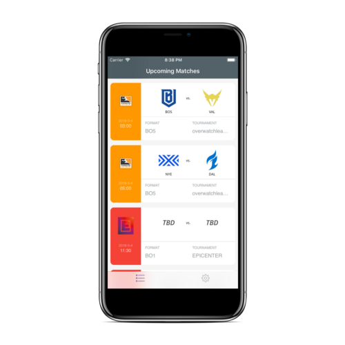
Old design of the Esports Calendar iOS app

Esports Calendar did not had ‘modern’ UI
In a period where a lot of applications is pushing for dark-mode (i.e. Apple MacOS Mojave apps), Esports Calendar did not have that ‘cool’ look. While building the first design, I did not put enough focus on the design. This was in the end a mistake since it ruined my own UX after long usage. The UI was too ugly for a modern esports fan and it needed to be improved.
Esports Calendar favouriting or notify me feature usage was a big hassle

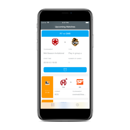
This was probably my biggest mistake. To use the ‘notify me’ feature for an esports match. The user had to go through four steps:
- Find the match
- Click/Tap on the match
- Wait one to two seconds for the unfolding animation to show the feature
- Click on the alarm clock button
People could suggest that this feature is the second most important feature. (Next to showing esports matches from various games.) For such an important feature, it took the user four steps to accomplish his/her goal. This was a big UX mistake.
Process to improve the UI and UX
To improve the UI and UX of the Esports Calendar iOS app, I found, learned and used various tools to look for inspiration. While there are many platforms out there, the biggest one I used was Dribbble. Dribbble has a big community of talented designers that create beautiful things. This also meant app designs.
There were many designs that inspired me. In the end, I combined (most of) them within the Esports Calendar iOS app and the result is as next.
New auto notifications feature

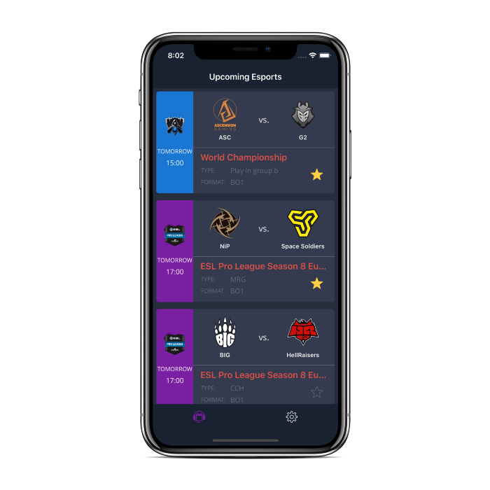
This design improved the overall UI and UX compared to last version. By taking inspiration from other dark mode applications on Dribbble and existing ones (Twitter, Overcast and Netflix), the Esports Calendar app has now a more ‘modern’ look.
In this new design, the notify me feature UX has also been improved. Instead of ‘notify me’, it is now a ‘star’ feature. The folding and unfolding animations are removed, thus the star feature is immediately accessible without any extra taps or wait times.
New auto notifications feature

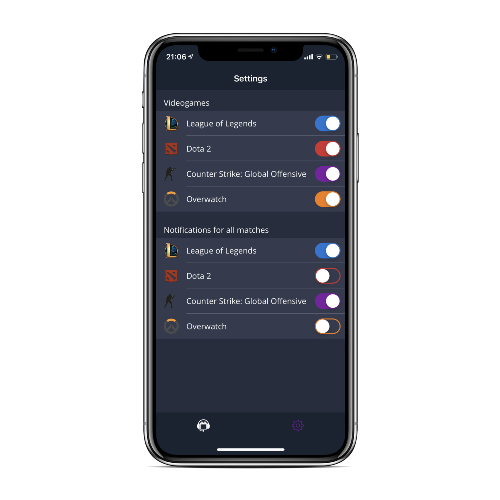
While updating the UI of the Esports Calendar iOS app, the settings tab is also updated. To show more clarity in the settings tab, videogames icons are also added. But this was not the only update.
Since starring an esports match is an important feature, it was still a hassle. In a scenario where users want to star multiple matches at once, the user had to tap multiple times. There were also other scenarios like wanting to always retrieve notifications of a specific videogame. Thus, this feature is implemented within the settings tab. If the user want to auto star all the matches of a specific videogame, just tap the switch. Now you will receive all notifications from your favourite esports matches!
Learnings
- Take inspiration from existing material from others online
- Make extensive use of the app to know what is good, but also what is wrong