Today in the morning I installed macOS Big Sur. Here are my initial impressions.
I always like it when Apple redesigns their OS versions. It feels like I’m using a completely new computer.
This is included in the new design of Big Sur. The text fonts and colors changed and more things are translucent. You can especially see it in the menu bar or finder.
I like it since it seems more simplistic.

Menu Bar - Big Sur
The Notification Center has also been changed. I’m glad cause I never used the old one. With the additions of widgets, it seems a bit more useful now.
But it still doesn’t have a clear all notifications button 😴. A missed opportunity.
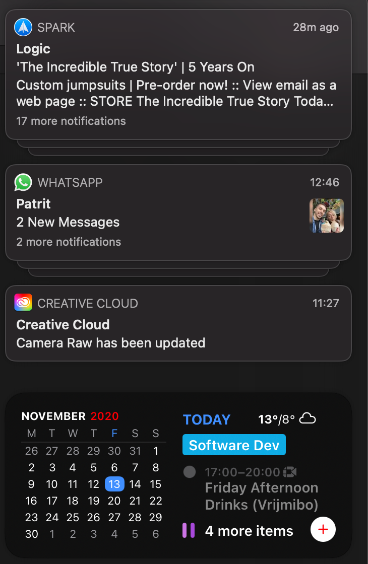
Notification Center
Lots of apps have now a Big Sur-ish icon design as well, but that is too subjective. For me, it is ugly since I don’t like the return of 3d icons.
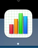
Numbers - Big Sur ugly icon
Control Center is also available now in Big Sur. It should be nice for the people that use a mouse or trackpad often. But I can change all these settings within the keyboard Touch Bar. Which is also faster, so I don’t see the benefit that much here.
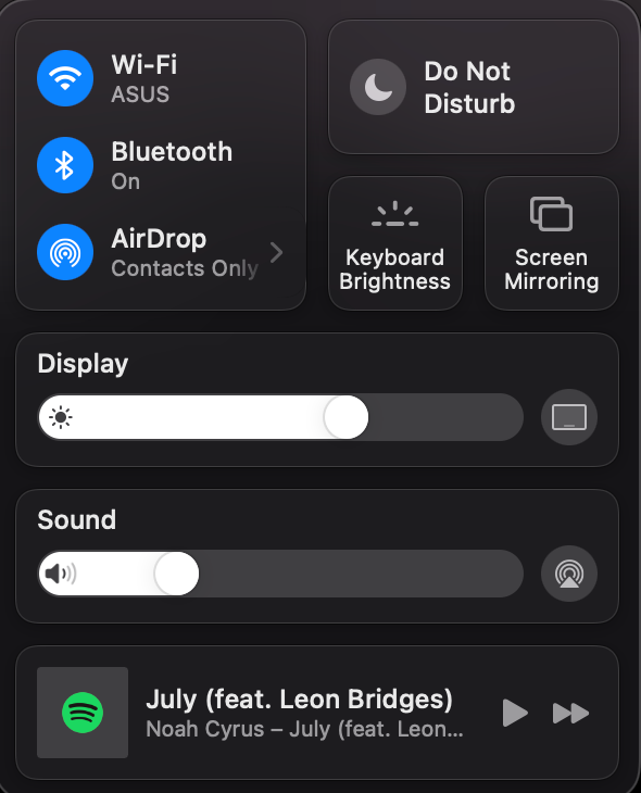
Why do I need this when all these are available on touchbar
I’ve also switched to Safari from Brave. Honestly, Safari is as fast as Brave now. Problem is that it doesn’t have an extension yet with Workona. If I truly miss it in the next month, I will return to Brave. For now, Safari seems great.
So far the day one impression is nice. I’ve experienced some bugs with audio that crackles when I switch between AirPods or 3.5mm external headphones/speakers. Mostly in Google Meets and YouTube so it may be a bug of Safari.
But overall a good change in the macOS system. 🎉